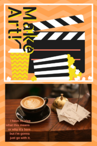
I just attended a brief webinar regarding Adobe Spark. In case you haven’t heard of it, it’s a browser-based (iOS App – Android may be coming) tool to create graphics, presentations, and now video packages that are web and social media friendly. Much like Canva and other similar applications its goal (as nearly as I can determine) is to make it easier for non-designers to design.
One could argue it means people who had no access to design can now employ it. That is, people living away from major urban centers where designers typically are available, people who have little or no budget for such things, etc. will now be able to run with the big dogs.
Okay. That’s fair.
But it also can be argued that the big dogs can employ the system to replace at least some part of the work they’d have farmed out to those designers. That seems counter intuitive for a company that has, essentially, led the marketplace in digital tools for designers.
In theory the now “free” service will have premium pay levels in the future. Which means that not only will Adobe have taken business from the designers they’ve served faithfully for decades, they’ll be directly competing for the design dollar.
Now I understand some of this. I’ve been a loyal customer since Photoshop was only black and white and Illustrator was for designing type outlines. Adobe’s move to Creative Cloud a couple of years ago didn’t thrill a lot of creatives, and several problematic releases did little to win friends. So I get that they have an interest in a consumer facing product line, and I get that they sense competition from Canva and others who will reduce demand for professional design services, and thereby reduce demand for professional design software.
But the problem here is the basic premise that you can “bottle” creative content. I have given many presentations regarding the use of digital technology to make art, and frequently have to point out that there is not a “make art” button. Technology is a tool, the results of which depend entirely on the skill and experience of the user.
I have dabbled with several of these browser-based content creation tools. Frankly, I can get the exact result I want using my professional tools faster than I can get close with the online system. Well, that’s to be expected. The online system is free or (at present) still less that the monthly subscription for those professional tools.
But really, given the decades of experience I have with those tools, it’s really not worth my time to use the online system. When I can build a branding package for myself and/or my clients that I can rapidly adapt and expand – using established logos, typefaces, color schemes, design styles, etc. it’s simply not practical to try and build even a part of that into a system that’s primary goal is to create something that looks “trendy”.
Which is the chief problem with the “Make Art” button approach – regardless of how you put it together, the systems will only create a certain number of viable combinations. That is, you can only combine “canned” background and typeface and copy and color scheme and artwork and photo in a finite number of ways. The result will be essentially similar to all the other ways that you can combine that same content and of those ways there is also a lesser number which will present a pleasing or effective design. The rest just look bad.
In other words, the online design systems will be very effective in providing you with content that looks a lot like the content everyone else using the design systems is producing. It’s the same reason sooooooo many websites that use WordPress as a base look exactly the same as all the other websites. There appears to even be a belief that this trend makes such website more accessible and therefore more likely to be used than old fashioned expensive hand coded uniquely designed websites. Similarly the canned “make art” designs pop up everywhere and so people believe that’s good design, or effective design, or at least that it pops up everywhere so that must mean something.
I’m not slamming Adobe (or Canva for that matter) here. I have recommended those systems for people who can’t afford a professional rate, or need to be able to put up something on the old Facebook in a hurry and don’t have a real designer on staff. And as I suspect some of the premium (at this point removing the Spark branding is the only one) features of Spark will accrue to the Creative Cloud subscription that I already maintain, I will probably make more use of it going forward myself.
But when we, as a society of consumers become satisfied with the design equivalent of a Big Mac, we are doing a disservice to our culture and our future. The democratization of access to the tools is a fine idea. But lets be sure to make it clear that not every use of that tool is a winner.


